We use cookies on this site to enhance your user experience
By clicking the Accept button, you agree to us doing so. More info on our cookie policy
We use cookies on this site to enhance your user experience
By clicking the Accept button, you agree to us doing so. More info on our cookie policy
Published: Nov 23, 2019 by C.S. Rhymes
I was thinking about what features I could add to my Jekyll theme and it occured to me that I didn’t really promote my theme very well on my own website. As my website uses Bulma Clean Theme it gave me a good opportunity to create a new feature for my theme, that I could end up using to promote my theme. A bit of a win, win situation.
If you had seen one of my previous posts on dev.to, I had started creating a whole theme that could be used to showcase your work. I had put a lot of work into the layout and had written a lot of custom css, but if I was honest with myself, it just looked very busy.
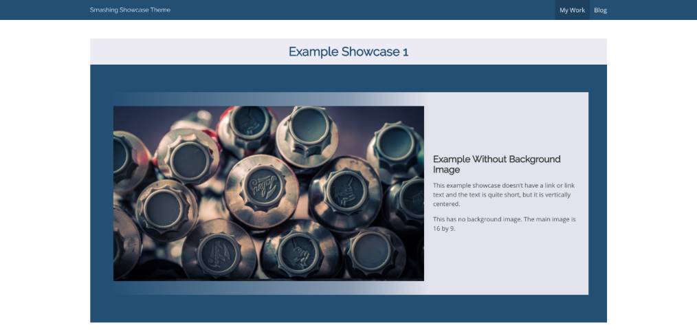
I struggle with web design as I know when something is not quite right, but then I can’t always put my finger on why it’s not right and how to make it better. I considered trying to reuse what I had built on the other theme, after all I had put a lot of effort into it, but it just wasn’t right.
It’s easy sometimes to look at other sites and think about copying their design and just tweaking it a bit to make it seem like your own idea, but I wanted something a bit different, but still simple and reusable.
Rather than thinking about the way it looked, I decided to change my concentration to thinking about the content I wanted the layout to contain first. That way, at least if it didn’t look amazing, it would still be practical.
The first thing I wanted was a large image. This would grab users attention and allow people to show off their work without leaving the page. I started with a 16 by 9 image which seemed to work with my specific image I had for my use case, but then I thought this might not be the best ratio for all projects. I decided it would be useful to have 16 by 9 ratio as the default, but to also allow it to be overwritten if desired.
Next I needed to display the title, subtitle and some description text. After all, you want to let people know what the name of your work or project is and summarise what it is all about.
The Bulma title class was the obvious choice for the name. The Bulma subtitle class could be used to explain briefly what the project is, such as whether it is a website, an app or a package of some sort. The description was some paragraphs of text so I decided to use the Bulma content class.
I added the elements to the page under the image. By default the title and subtitle classes align nicely under each other, but the content was all left aligned and seemed strange with the image above taking the whole width.

This led me to centering the content under the image and it seemed to flow much better.

The next issue was the width of the text content. The title and subtitle were fairly short and looked neat centered, but the text seemed too wide and hard to read. I decided to limit the width of the text to two thirds of the page which made it much easier to read, but also looked nicer with a bit of white space around it.

The next most important thing was allowing people to find out more information about the work you are showcasing. If you are promoting your web design skills then people will probably want a link so they can see it for themselves, or a link to your packages documentation so they can start using it. I added a link with the button class so it stood out more.

Sorted, nice and simple.
Then I thought about how I would use this layout for my specific use case. I wanted to have the ability to add a list of bullet points to promote some key points so the visitor to the site doesn’t have to read a block of paragraph text if they didn’t want to.
The text above was all centered to display nicely under the large image, but bullet points don’t look good centered. This is one area where there isn’t a standard class built into Bulma that I could use to format a list, or at least one I don’t know about anyway.
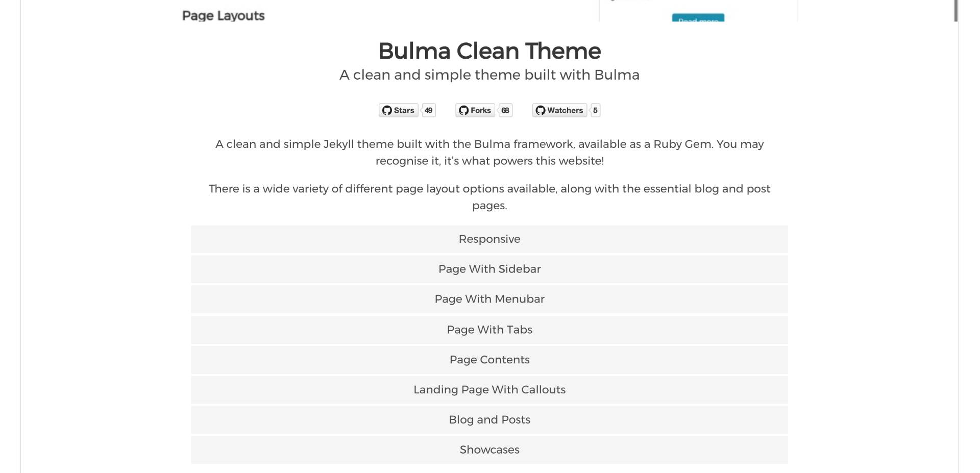
I decided to swap the list to a series of divs and then added a bit of css so they had some spacing around the text, between the divs and a light background colour to break them up from the description text above.
Lastly I wanted to promote what technology I had used in this project. I had already used a list for the features, so I looked at what other styles Bulma offers. I stumbled across Bulma tags, which are described as:
The Bulma tag is a small but versatile element. It’s very useful as a way to attach information to a block or other component. Its size makes it also easy to display in numbers, making it appropriate for long lists of items.
Perfect.

Tags are nice and simple to use, just a div or a span with the class tag. If you are displaying multiple tags there is a tags class that you can apply to the container element. This allows the tags to be nice and evenly spaced. As the content above was all centre aligned the tags looked a bit strange left aligned, so I used the is-centred class to centre align these as well.
I looked at what I had just created and realised that there was very minimal custom css for this layout. My old showcase theme had a lot of custom css and looked very busy. This new showcase layout was much simpler, had taken much less time to build and the end result was much better.
I guess what I have learnt from this process is that using a content first approach allowed me to create a better result than trying to start with a layout and then trying to force the content to fit the design.
I’ve worked with some great web designers in the past who seem to be able to just draw out a layout and it looks great. I would firstly and foremostly call myself a web developer rather than a web designer, but by forcing yourself to work on areas that you don’t feel comfortable with is sometimes the best way of gaining knowledge first hand.
To summarise, here are a few points that I have learnt in the process:
What important lessons have you learnt about web design and working with frontend frameworks?
Share
Latest Posts

I thought I’d share some learnings about how to host a Next.js site with AWS Elastic Beanstalk. This is a minimum configuration to get a basic site up and running.

I’ve seen a few posts recently asking what other authors use for their website. There are many options available, but sometimes you just want a single page with links to your social media profiles and links to your books. This is where Bulma Clean Theme and GitHub pages can come to the rescue.
Building a modern website can sometimes lead you to be so far separated from the end result that is sent to the user. Developers can end up focusing on building sites with component based frontend frameworks, fetching data from APIs and installing hundreds of npm dependencies. We can become more interested in writing great code in their chosen programming language than what we serve to the website visitors. How did we get so far away from writing HTML?
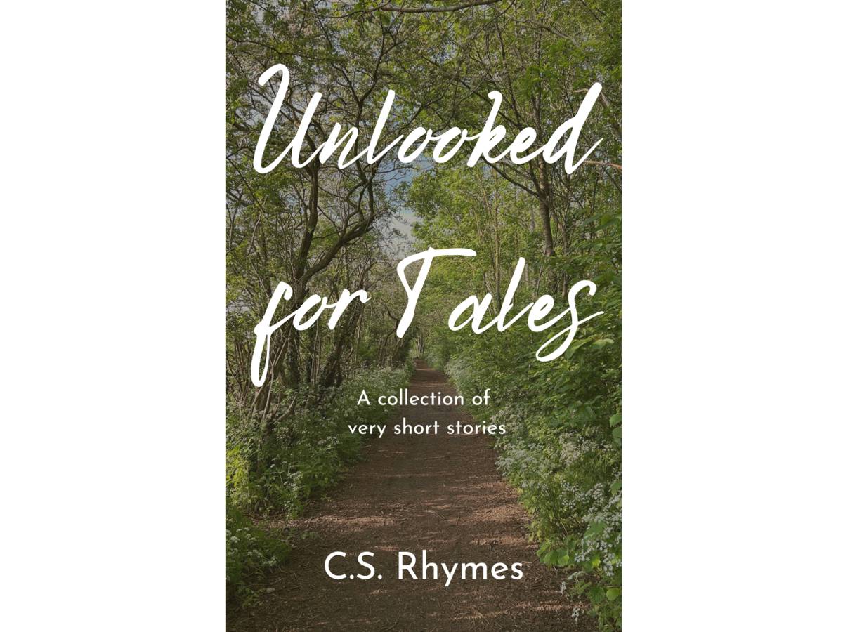
Unlooked for Tales - a collection of short stories
By C.S. Rhymes
Free on Apple Books and Google Play Books
Nigel's Intranet Adventure
By C.S. Rhymes
From £0.99 or read for free on Kindle Unlimited!