We use cookies on this site to enhance your user experience
By clicking the Accept button, you agree to us doing so. More info on our cookie policy
We use cookies on this site to enhance your user experience
By clicking the Accept button, you agree to us doing so. More info on our cookie policy
Published: Jul 29, 2025 by C.S. Rhymes
I’ve only just started using TailwindCSS, (I know late to the party huh), and I wanted to create a custom toggle switch that looked a bit nicer than a standard checkbox. This blog post goes through some of the thought processes and the tools that Tailwindcss v4 has out of the box that you can make use of.
As I said, I wanted a checkbox to look nice, but what was really important to me was that it could still be used as a checkbox so it would be usable with a keyboard and work with Livewire, so when the state was updated the page would also update.
<label>
  <input type="checkbox" />
</label>
I also wanted on and off labels to indicate what was changing when the checkbox was checked or unchecked.
<label>
  <input type="checkbox" />
  <span>Off label</span>
  <span>On label</span>
</label>
I have added some basic styles to make the labels appear side by side using flexbox, round the labels edges, and added the background colour of violet-700. The off label has a white background and the on label has a violet background to match the label background colour.
Next we want to hide the checkbox from view, but still keep it in the page and make it visible to screen readers. We can use the sr-only utility for this.
<div class="inline-flex">
  <label
    class="cursor-pointer flex flex-row rounded-full bg-violet-700 px-2 py-2"
  >
    <input type="checkbox" class="sr-only" />
    <span
      class="mr-2 inline-flex cursor-pointer rounded-full bg-white px-4 py-2 text-black"
      >Off label</span
    >
    <span
      class="inline-flex cursor-pointer rounded-full bg-violet-700 px-4 py-2 text-white"
      >On label</span
    >
  </label>
</div>
I need the style of the labels to change based on the state of the checkbox. So if the checkbox was checked then the ‘On label’ should be prominent, but if it was unchecked then I wanted the ‘Off label’ to be prominent.
Tailwind has a peer utility that allows you to style based on a sibling’s state. This was perfect for my needs.
We can add peer to the checkbox class:
<input type="checkbox" class="peer sr-only" />
Then we can add the styles for the checked state for the off label using
peer-checked: to swap the text colour and background colours so it has a
violet background and white text when the checkbox is checked.
<span
  class="mr-2 inline-flex cursor-pointer rounded-full bg-white px-4 py-2 text-black peer-checked:bg-violet-700 peer-checked:text-white"
>
  Off label
</span>
Then we do the opposite for the on label by making the background white and the text black when the checkbox is checked.
<span
  class="inline-flex cursor-pointer rounded-full bg-violet-700 px-4 py-2 text-white peer-checked:bg-white peer-checked:text-black"
>
  On label
</span>
Now when we click to check and uncheck the checkbox, the highlighted label will also update to reflect whether the checkbox is checked or not.
We can also use the keyboard to focus on the checkbox using tab, then use space bar to check and uncheck the checkbox input, changing the label appearance.
It’s always useful to indicate the focus state of an input, especially for keyboard users. But in our case we have hidden the checkbox, except for screen readers so how can we show the element is focused?
Again, Tailwindcss has you covered with the focus-within utility that lets you apply styles to a parent element when the focus state is within the parent.
We can add an amber outline by using focus-within: on the outer label.
<label
  class="cursor-pointer flex flex-row rounded-full bg-violet-700 px-2 py-2 focus-within:outline-4 focus-within:outline-amber-400"
>
  <!-- Input content here -->
</label>
Now when we focus the state by clicking with the mouse or selecting the checkbox with the keyboard then the outline appears.
To make the transition between the on and off states a bit smoother and animated we can use Tailwind’s transition utility and add it to both spans.
Here we add transition-all duration-700 ease-in-out to tell tailwind to transition all items with a duration of 700ms and using ease-in-out transition timing feature.
<span
  class="mr-2 inline-flex cursor-pointer rounded-full bg-white px-4 py-2 text-black transition-all duration-700 ease-in-out peer-checked:bg-violet-700 peer-checked:text-white"
>
  Off label
</span>
See the Pen Untitled by CS Rhymes (@chrisrhymes) on CodePen.
This focuses purely on the styling, but I think further work would be needed to make this fully accessible by adding additional aria attributes to indicate to users the current state of the checkbox.
Photo by Candace McDaniel on StockSnap
Share
Latest Posts

Recently I had the opportunity to work on a new side project. I had already decided I wanted to use Laravel and Livewire, but I wasn’t sure about the frontend user interface. I had seen some demos of Flux UI and liked what I had seen, so decided to give it a try.

I thought I’d share some learnings about how to host a Next.js site with AWS Elastic Beanstalk. This is a minimum configuration to get a basic site up and running.
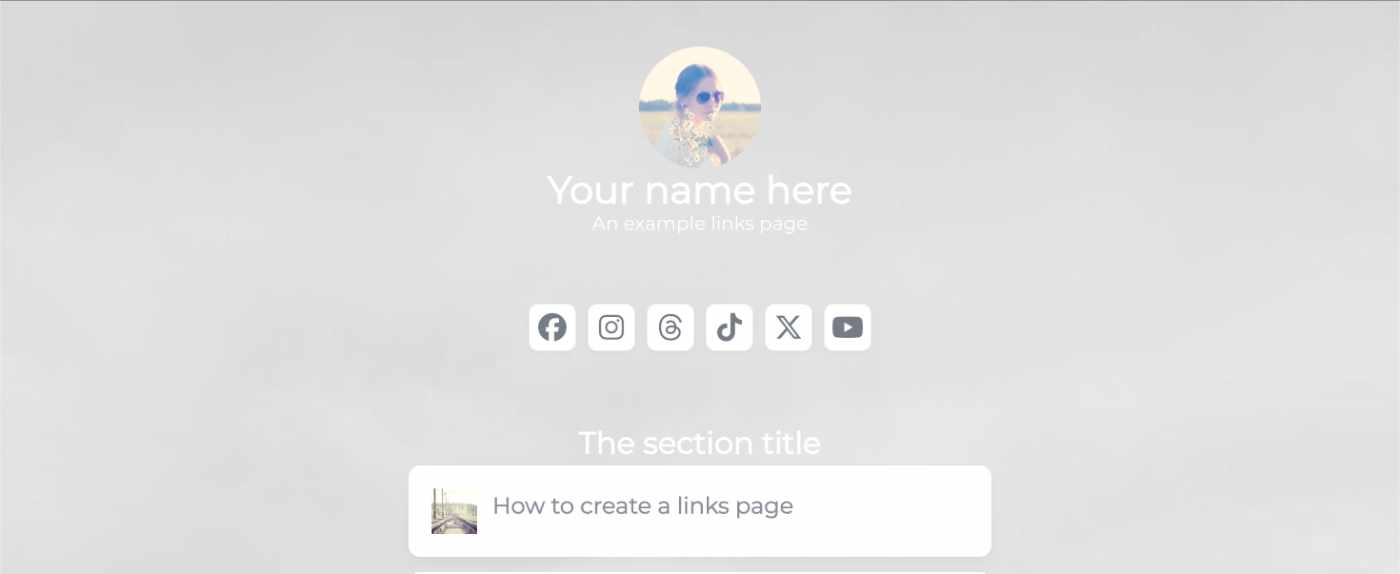
I’ve seen a few posts recently asking what other authors use for their website. There are many options available, but sometimes you just want a single page with links to your social media profiles and links to your books. This is where Bulma Clean Theme and GitHub pages can come to the rescue.
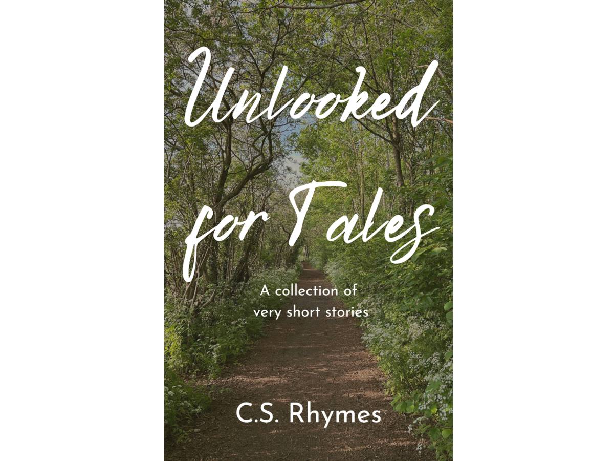
Unlooked for Tales - a collection of short stories
By C.S. Rhymes
Free on Apple Books and Google Play Books
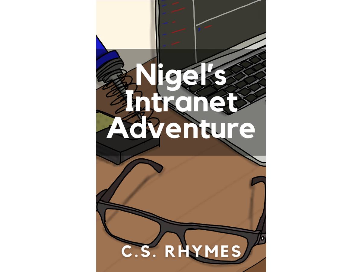
Nigel's Intranet Adventure
By C.S. Rhymes
From £0.99 or read for free on Kindle Unlimited!