We use cookies on this site to enhance your user experience
By clicking the Accept button, you agree to us doing so. More info on our cookie policy
We use cookies on this site to enhance your user experience
By clicking the Accept button, you agree to us doing so. More info on our cookie policy
Published: Sep 27, 2014 by C.S. Rhymes
I was recently asked to update the website for Orkos House. The old website was built with a free website creator and used tables for the page layout. It had some great images and I saw a lot of potential for this site.
I had used foundation to make this website and found it very flexible. I wanted to explore some more of the features available in the framework so I thought it would be prefect for this project.

When using a framework, there is the potential that your site may look very similar to other sites made with the framework. An easy way of customising your site is to use a web font. I like to use Google Web Fonts and after a few tries I can across the perfect font, called Rock Salt, for the header tags. You just need to be aware that the web fonts add additional loading time to your page and you need a fallback font in case it doesn’t load correctly for some reason.
To help make the layout consistent I made use of the very easy to use Grid. The grid is responsive and adapts to different screen sizes. As its mobile first, you set the way you want it to look on a smartphone (small screen) and then you can add additional classes for medium and large screens (such as tablets and desktops).
The main content was made using a single column and the footer was split into two sections that sit above each other on a smartphone and fit across the screen on larger screens.
The Block Grid offers an easy way to layout items in a list evenly across the page. This was really useful when laying out the videos and images on the pages. Again, like the grid, the block grid has the option to change the way it looks on the three different screen sizes if you want to.
The site had a few videos and Foundation offers a Flex Video class that will automatically resize the height of the video to the width of the video on the page. This ensures that the video is in the correct apect ratio. I used flex video within the block grid to set the width of the videos. This meant the width was set by block grid and the height was set by flex video.
As well as having thumbnails on the page using block grid, I also used the Clearing Lightbox so that users can click on the image to see it full size. The clearing lightbox shows thumbnails for the other images in that gallery on a larger screen, but on a mobile it shows only the image.
As this site only needed a few pages I made them out of static HTML. If I were to use foundation on a larger project then I would want a CMS in the background. There are a few options for this, including making your own CMS with the Foundation frontend, but I found FoundationPress from olefredrik that works with WordPress. I think that this is something that I’ll have to look into in more detail.
Share
Latest Posts

Recently I had the opportunity to work on a new side project. I had already decided I wanted to use Laravel and Livewire, but I wasn’t sure about the frontend user interface. I had seen some demos of Flux UI and liked what I had seen, so decided to give it a try.

I thought I’d share some learnings about how to host a Next.js site with AWS Elastic Beanstalk. This is a minimum configuration to get a basic site up and running.
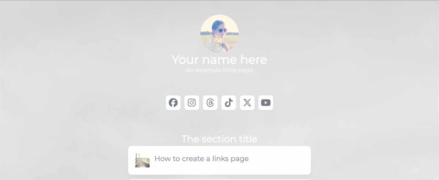
I’ve seen a few posts recently asking what other authors use for their website. There are many options available, but sometimes you just want a single page with links to your social media profiles and links to your books. This is where Bulma Clean Theme and GitHub pages can come to the rescue.
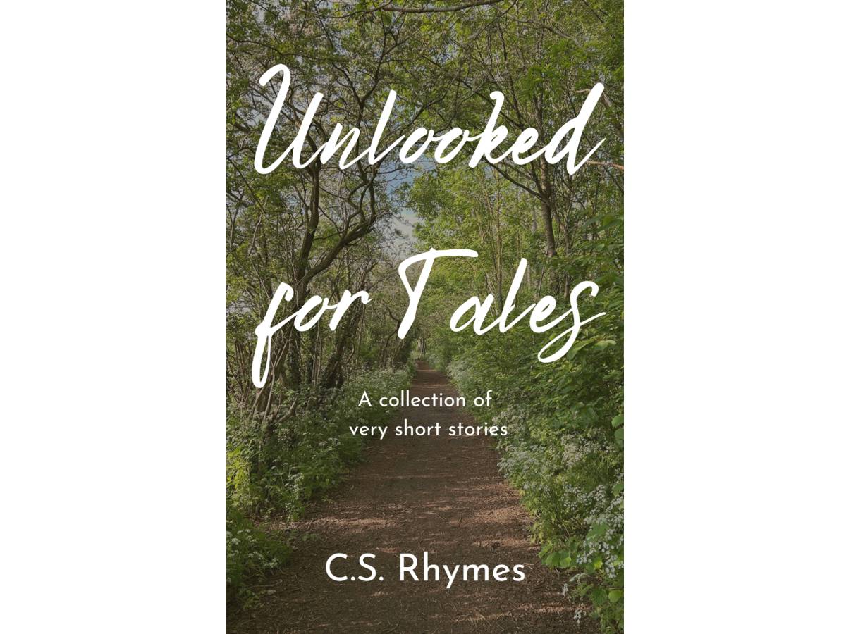
Unlooked for Tales - a collection of short stories
By C.S. Rhymes
Free on Apple Books and Google Play Books
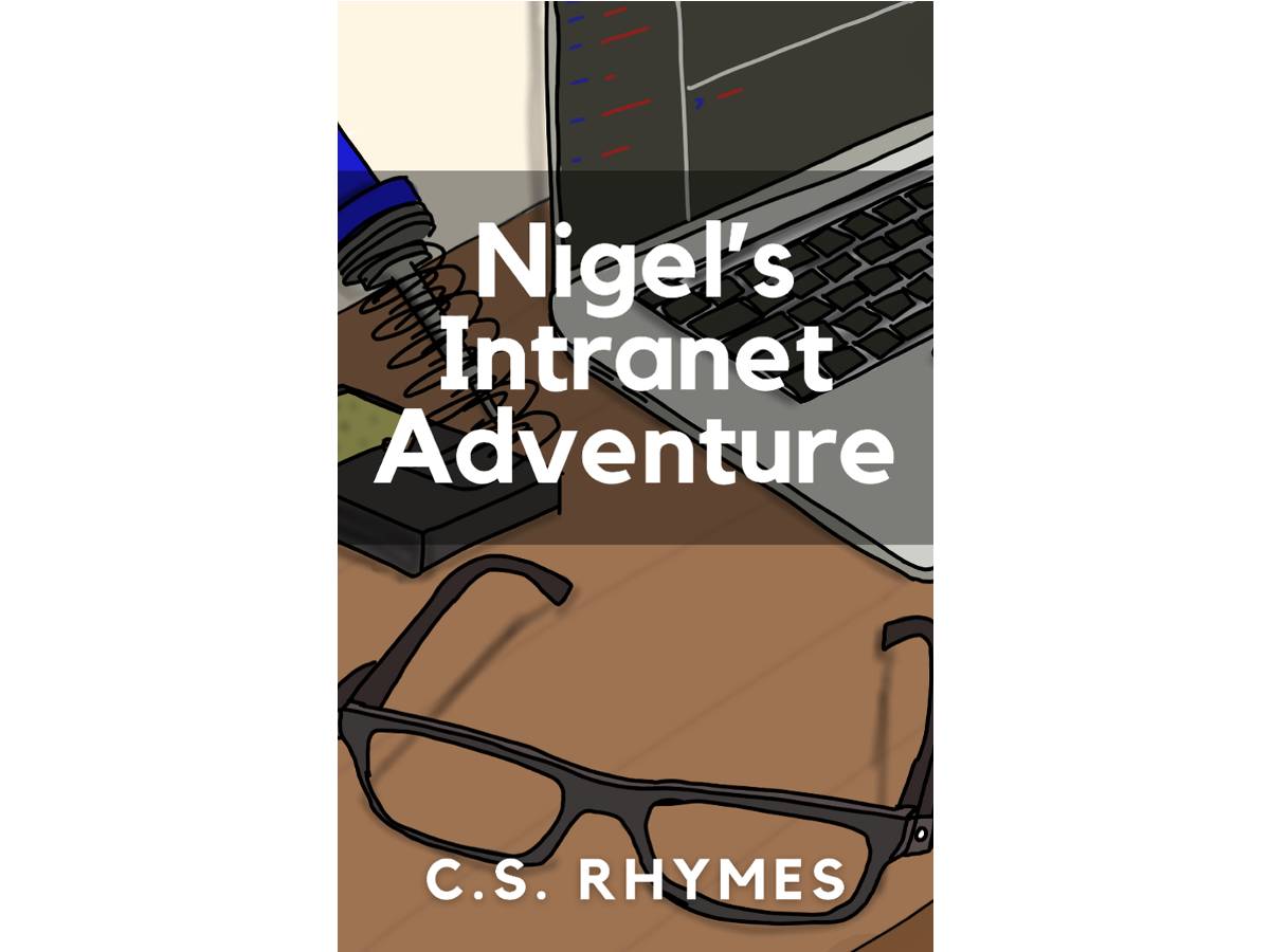
Nigel's Intranet Adventure
By C.S. Rhymes
From £0.99 or read for free on Kindle Unlimited!